A fixed header should be a straightforward piece of a website: keep navigation visible, support conversion, and make the site feel polished. In WordPress, that same header can start behaving differently the moment someone logs in, especially on mobile.
This post does three things:
- Helps you identify when the WordPress admin bar is the real cause of your header spacing issues
- Shows you a practical, working fix (with real breakpoint behavior and code you can adapt)
- Explains why this ends up being more conditional logic than most site owners expect, and why many modern platforms avoid this entire category of problems
What this issue looks like
If you have a fixed header and someone reports any of the following, you are likely dealing with the WordPress admin bar:
- The header overlaps the top of the page when logged in
- The header looks fine logged out, but logged in it sits too low or too high
- The header is correct on desktop but wrong on mobile (or vice versa)
- There is a mysterious gap above the header on small screens
- The gap changes after scrolling, or only appears at certain widths
These are not “random CSS glitches.” They are often the direct result of WordPress adding its own UI (the admin bar) on top of the site, with behavior that changes across breakpoints.

Why WordPress causes this because the admin bar is not consistent across devices.
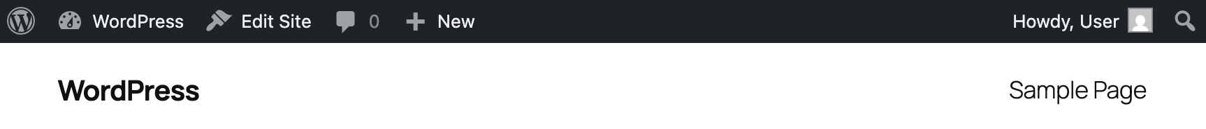
When a user is logged in, WordPress injects an admin toolbar (#wpadminbar) at the top of the site. That toolbar changes the “true” top of the viewport. If your header is position: fixed, you now have two fixed things competing for the same space.
The detail that causes the most trouble: the admin bar does not behave the same at all viewport widths.
Here is the practical behavior many WordPress sites encounter:
If your header does not adjust its top offset to match these states, it will either overlap the admin bar or create incorrect spacing.
The extra layer most people miss: WordPress breakpoints may not match your site’s breakpoints
Your website’s responsive breakpoints are based on your design system (common menu changes happen at 768px, 1024px, 1200px, etc.). WordPress has its own breakpoint behavior for its admin UI.
When those do not align, you end up supporting overlapping ranges like:
- Your site is in “mobile nav layout,” but WordPress is using “desktop admin bar behavior,” or the other way around
- A header offset that was correct at your breakpoint becomes wrong at WordPress’s breakpoint
- The fix becomes “add another conditional,” which becomes “add another override,” which becomes “why does this keep coming back?”
This is why WordPress header bugs often feel persistent. You are not just styling your header, you are also adapting to WordPress’s UI rules.
A real example: a two-layer fixed header (and why it complicates offsets)
In the scenario you described, the fixed header is actually two stacked fixed elements:
.top-bar: a colored utility strip (34px tall, desktop only).mega-menu-header: the main navigation bar (logo, mega menu, search)
Both are position: fixed. That is an important detail.
If the admin bar is present, both fixed elements need to move down. If only one moves, they collide. If they move down by the wrong amount at a given width, you get overlap or gaps.
The good news: once you model the problem correctly, the solution is very consistent.
The fix
You want your header offsets to be determined by three things:
- Is the user logged in? (WordPress admin bar exists)
- Which admin-bar behavior is active at this viewport width? (32px vs 46px, fixed vs absolute)
- Is the header composed of one fixed bar or stacked fixed bars? (top-bar + main header)
Below is the exact approach you can adapt.
Solutions by viewport
Desktop (>1199px) (Logged out)
.top-baris visible attop: 0.mega-menu-headersits below it attop: 34px
(Your existing theme CSS likely already does this.)
Desktop (>1199px) (Logged in)
Now we must account for the admin bar height (32px) plus the top-bar (34px):
body.admin-bar .top-bar {
  top:32px;
}

body.admin-bar .mega-menu-header {
  top:calc(32px+34px);/* 66px */
}This ensures:
- the admin bar is on top
- the top-bar sits directly below it
- the main header sits below both
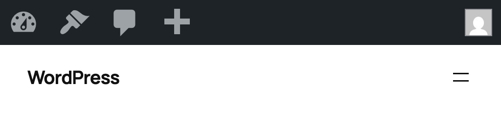
Mobile (≤1199px) (Logged out)
On mobile, the .top-bar is hidden (because links are in the drawer), and the main header returns to the top:
@media (max-width:1199px) {
  .top-bar {
    display:none!important;
  }

  .mega-menu-header {
    top:0!important;
  }
}
At this stage, everything is simple again until the user is logged in.
Mobile 783px–1199px (Logged in)
In this range, the admin bar is typically 32px and fixed, so it never scrolls away. The header needs a 32px offset:
@media (min-width:783px)and (max-width:1199px) {
body.admin-bar .mega-menu-header {
    top:32px!important;
  }
}
Tablet <782px
@media (max-width:782px) {
body.admin-bar .mega-menu-base {
    top:46px;
  }
}

@media (max-width:782px) {
body.admin-bar.is-scrolled .mega-menu-base {
    top:0;
  }
}
Mobile 601px–782px (Logged in)
Here, the admin bar becomes 46px and stays fixed. Offset accordingly:
@media (min-width:601px)and (max-width:782px) {
body.admin-bar .mega-menu-header {
    top:46px!important;
  }
}

@media (min-width: 601px) and (max-width: 782px) {
  body.admin-bar.is-scrolled .mega-menu-base {
    top: 46px;
  }
}
Mobile ≤600px (Logged in)
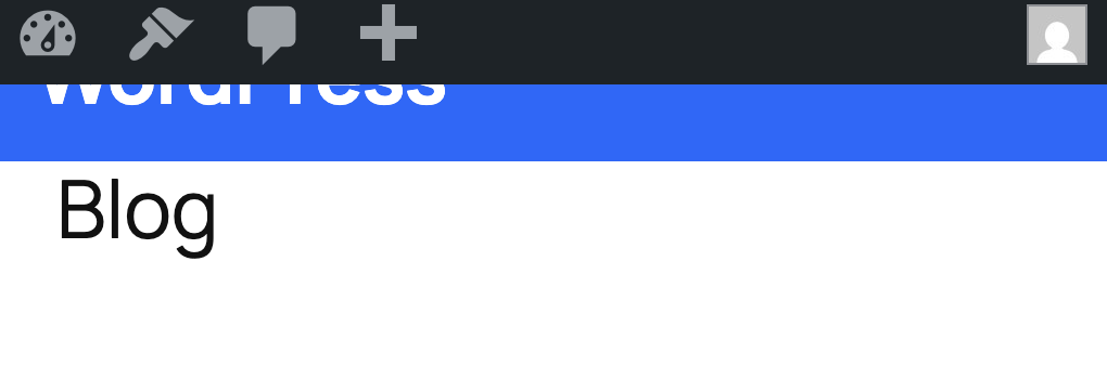
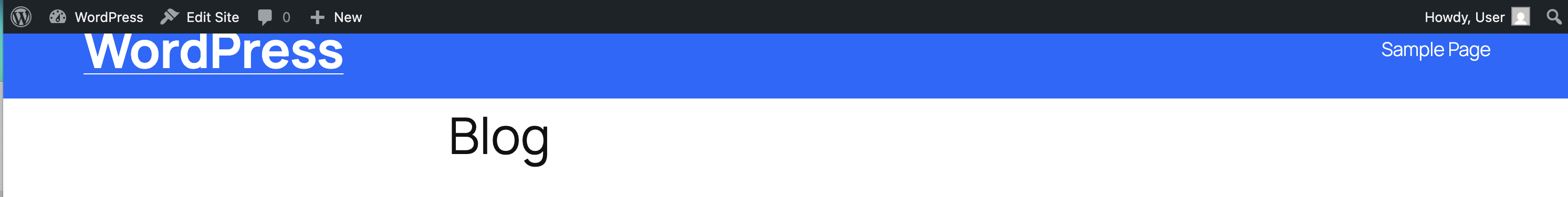
At ≤600px, WordPress often switches the admin bar to position: absolute, which means it scrolls away.
That creates a weird visual problem:
- At the top of the page, your header must sit below the admin bar (46px)
- Once you scroll, the admin bar is gone, and your header should return to
top: 0(otherwise you get a gap)
A clean way to handle this is to start with top: 46px, then flip to top: 0 when the user scrolls:
@media (max-width:600px) {
body.admin-bar .mega-menu-header {
    top:46px!important;
  }

body.admin-bar.is-scrolled .mega-menu-header {
    top:0!important;
  }
}
This avoids the “floating gap” effect on scroll.
JavaScript: scroll detection that drives the ≤600px fix
You already have the right pattern: toggle a class on <body> when the page scrolls. The key detail is to run it once on load, so a refreshed page mid-scroll renders correctly.
functionupdateScrolledState() {
if (window.scrollY>0) {
primaryNav.classList.add('is-scrolled');
document.body.classList.add('is-scrolled');
  }else {
primaryNav.classList.remove('is-scrolled');
document.body.classList.remove('is-scrolled');
  }
}

window.addEventListener('scroll',updateScrolledState, { passive:true });
updateScrolledState();// run once on load
You are using:
#primary-navigation.is-scrolledfor styling (shadow/border)body.is-scrolledfor layout correction at ≤600px
That is an effective separation.
Mobile nav drawer open state
When the mobile menu drawer opens, you are also preventing stacking problems by forcing the top-bar to stay hidden:
body.mobile-nav-open .top-bar {
  display:none!important;
}
This is a practical “do not let fixed layers stack unpredictably” rule, especially when the drawer introduces its own fixed positioning and scroll locking.
Summary: what your header should do in each range
If you implement exactly that behavior, the “admin bar breaking the header” problem becomes stable.
Key files to keep organized
Based on your implementation, this is the right separation of responsibility:
- Header offset rules:
assets/css/theme/mega-menu.css - Base top-bar styling:
assets/css/theme/theme.css - Scroll state + drawer state classes:
assets/js/mega-menu.js
Keeping the offsets consolidated in one CSS file is the difference between a fix that holds up and a fix that keeps getting re-patched.
What you should do
Option 1: Coded Solutions to make the WordPress Admin Bar compatible with your theme
If your WordPress site has a fixed header, this admin-bar issue will eventually show up. This will come up late in the QA process, or when an editor logs in on a phone and reports a layout problem no one saw during development.
The best fix is a coded solution that matches WordPress’s admin bar behavior, respects your site’s own breakpoints, and accounts for the one range (≤600px) where the admin bar scrolls away.
Once you’ve done that, the header becomes stable again and you have a clean example of why WordPress maintenance often includes corrective layout work that many businesses did not budget for.
Option 2: Remove the WordPress Admin Bar (So Your Header Stops Needing Offsets)
If you want a toggle without custom development or you want it enforced by role, then use a plugin that only handles the toolbar and nothing else.
Here are several common options on WordPress.org:
- Remove WP Admin Bar (role-based visibility controls)
- Hide Admin Bar (hide toolbar; supports role-based settings)
- Hide Admin Bar from Non-Admins (simple: hides toolbar for anyone who is not an Administrator)
- Hide Front End WP Admin Bar (front-end only)
- Daisy Admin Bar (role-based hiding on the front end)
- Auto Hide Admin Bar (keeps it available but hidden until you hover at the top)
- Hide WP Toolbar (adds a hide/show control directly on the toolbar)
- Hide Admin Bar Based on User Roles (more advanced targeting options)
If you only need “hide for non-admin users,” pick the simplest role-based plugin. The more targeting options a plugin has, the more likely it comes with extra UI and logic you may not want.
Option 3: Remove it with code (most predictable)
If you want the cleanest setup, code is usually the most stable approach because you control exactly when the admin bar displays.
A) Hide for everyone on the front-end
Add this to a small custom plugin or your theme’s functions.php:
add_filter('show_admin_bar', '__return_false');This uses WordPress’s built-in show_admin_bar filter.
B) Hide for everyone except administrators
(recommended for most business sites)
This keeps the toolbar for true admins but hides it for editors/authors/subscribers
//https://developer.wordpress.org/reference/hooks/show_admin_bar/
add_filter('show_admin_bar', function ($show) {
  // Keep it for admins; hide for everyone else (front-end only).
  return current_user_can('manage_options');
});
C) Hide only on the front end, but keep it in wp-admin (explicit)
This is often what businesses want. No toolbar disrupting the public site, but no change to the dashboard:
add_filter('show_admin_bar', function ($show) {
  if (is_admin()) {
    return $show; // dashboard behavior untouched
  }
  return false;  // hide toolbar on front end
});
This aligns with how WordPress positions the filter: it’s intended for the front side of the site.
A note on CSS-only hiding (not recommended)
You can hide #wpadminbar with CSS, but it is usually the worst of both worlds:
- The admin bar markup still loads
- WordPress may still apply top-margin adjustments
- You can create new spacing inconsistencies (especially with fixed headers)
If you’re hiding it, hide it via the filter/plugin so WordPress doesn’t try to “help.”
Our Recommendation
The fact that there are so many WordPress plugins dedicated to hiding the admin bar is a signal in itself. When a platform needs multiple third-party tools just to stop a built-in UI element from interfering with common layouts like fixed headers, it tells you this is not a rare edge case. It is a recurring, widespread scenario. Businesses run into it often enough that “remove the admin bar” has become a standard request, and developers have responded by publishing dozens of variations to handle different roles, devices, and preferences. That ecosystem exists because the default behavior regularly creates avoidable layout work and extra testing, especially when marketing departments and site owners are logged in while reviewing pages on mobile.
This is an exorbitant amount of work for a fixed header!
From a business owner’s perspective, the surprise is not the fix. The surprise is the number of conditions required for something as common as a fixed header:
- Logged in vs logged out
- Desktop admin bar height vs mobile admin bar height
- WordPress’s breakpoints vs your site’s breakpoints
- Admin bar fixed vs absolute
- Scrolling vs not scrolling
This is the kind of maintenance work exists to keep the site behaving normally under a set of WordPress platform-specific rules.
Modern platforms avoid this kind of issue all together
In many modern website setups, the “admin UI” is not injected into the live public site in the same way:
- In a headless CMS workflow (for example, Storyblok + Astro), the editing interface lives in the CMS, and preview is handled through a controlled preview environment. The public site does not suddenly gain an extra toolbar that changes layout on certain devices.
- In Webflow, editing is built into the platform experience, and the published site does not require compensating for a WordPress-style admin bar across breakpoint ranges.
If your organization is spending time solving issues like this, it is worth stepping back and asking a practical question: should your website require a set of special rules just to keep the header aligned? For many businesses, the better long-term move is choosing a platform where the editing interface is not injected into the live site output in a way that changes layout behavior across devices. That is why we often recommend moving to a modern setup like a headless CMS build (for example, Astro with Storyblok) or a platform like Webflow. You get a cleaner front-end foundation, fewer “logged-in only” layout surprises, and updates that stay focused on growth, new pages, better conversion paths, and stronger SEO rather than ongoing corrective work to keep basic UI patterns functioning consistently.
